2018年最佳設計企業排行榜
|
當今社會,科技與全球化使得顛覆性創新發生得比以往任何時代都要快。為了保持優勢地位,那些聰明的企業紛紛從設計入手,以更好地聯系客戶,并找到自己的競爭優勢。 在本文中,我們就來說說各行各業的25家通過設計致勝的公司。其中既有蘋果這樣的老牌設計之王,也有Zalando這種中國讀者不太熟悉的公司。 當愛彼迎(Airbnb)的幾位創始人講起公司的創業故事時,他們經常提到2009年的那個時刻。當時創業孵化器Y Combinator的負責人保羅·格拉漢姆給了他們四句話的重要建議。 當時,愛彼迎的注冊房東只有不到一千人,創始人布萊恩·切斯基、喬伊·杰比亞和內特·布萊扎茲克蜷縮在硅谷的一隅,試圖靠搗騰數據和改版網站將公司做大。雖然愛彼迎一開始是家貌似很有前途的公司,但它每周的營收只有200美元左右。為了找到問題所在,格拉漢姆要求三個創業人對愛彼迎的用戶進行研究:他們的用戶到底在哪里? 在一篇報道中,《財富》記者利·加拉格爾描述了格拉漢姆聽到愛彼迎最大的客戶基數其實是在紐約之后的反應:“他停了下來,又對三人重復了一遍:‘也就是說,你們現在在加州的山景城,但是你們的用戶在紐約?’三人面面相覷:‘是的。’格拉漢姆對他們說道:‘那你們還在這兒待著干嘛?快到你們的用戶那里去!’” 飛越半個國家去客戶混在一起,這番訓話與硅谷的傳統智慧很不搭調,因為硅谷人歷來相信數據和技術能解決所有問題。不過在采納了格拉漢姆的建議后,愛彼迎確實迎來了關鍵的突破。比如他們發現,幫助房東給他們的房子拍些高大上的照片,是很能招徠住客的。 最近十年,“用戶體驗”已經成了一個被說濫了的詞。但它的基礎理念,也就是同理心的力量,卻也變得前所未有地強大。 這至少有兩個原因:首先是現代化全球化數字化的偉力正在打破一切傳統壁壘。大公司無法再依賴強大的產能、供應鏈和銷售網絡保護他們的優勢地位不受競爭對手挑戰。中國等新興經濟體的崛起以及大數據、物聯網、平臺經濟、人工智能等新興技術的發展,也使得大企業傳統的后端防御機制漸漸無法招架。其次是復雜性的原因。然而設計卻可以在這個紛繁復雜的超互聯世界中為我們帶來某種秩序與和諧。 在這種新常態下,明智的企業領導者們越來越認同設計是決定成敗的一個關鍵因素。好的設計可以讓你運用自己理解力取悅顧客和用戶,并且真正與他們建立聯系。 設計可以在紛繁復雜的超互聯世界中為我們帶來某種秩序與和諧。 近年來,各行各業都掀起了一場“設計運動”。“財富500強”企業紛紛高薪聘請首席設計官并投巨資建立設計中心和創新中心。各類專業服務機構也不甘人后。2013年,埃森哲收購了知名設計公司Fjord,而普華永道則重金吃下了數字創新咨詢公司BGT。2015年,麥肯錫公司收購了硅谷設計公司Lunar,同年10月,印度軟件巨頭威普羅收購了設計公司Cooper,這也是繼其2015年收購Designit后第二次收購設計公司。同時,不少頂級商學院和設計學家也紛紛開設跨學科課程,幫助MBA們像設計師一樣思考,或是讓設計師們像MBA一樣想問題。 在今天的“最佳設計企業”專題中,《財富》精心挑選了25家致力于通過設計獲得競爭優勢的公司。為了鑒定他們的設計水平,《財富》也在設計界進行了一番調查,訪問了多名高管,并且搜尋了許多證據證明這些企業在設計方面的投入。本文的結果在科學上并不嚴謹(畢竟設計這東西本身是很難量化的),而且它也并非一份充分完整的名單(現在將賭注押在設計上的企業太多了,光靠一期雜志顯然報導不完)。不過本文提到的企業都走在產品設計領域的前沿,且一心致力于打造更智能、更體貼的產品和體驗。 說到設計和“不同凡想”的偉力,沒有哪家公司比蘋果更有發言權了。雖說近幾年也有人提出,蘋果的設計魔力是不是有些消退了,但作為全球最有價值公司的蘋果依然在不斷推動創新設計的邊界。除了蘋果之外,包括Alphabet、亞馬遜、Nike在內的很多領先企業的成功,也離不開對設計的精益求精。“設計思維”原本是IDEO公司創始人大衛·凱利2003年生造的一個詞,但現在,它已經成了以用戶中心型思維構建產品和服務的同義詞。 當然,對于設計和“設計思維”的突然大熱,持反對意見的也不乏人在。比如在2017年紐約的一場設計大會上,Pentagram公司的合伙人娜塔莎·詹就做了一場題為“設計思維是狗屎”的演講,從而引發了一場激烈爭論。她的主要觀點是,設計從業者往往執著于標新立異,而忽視了自己的作品本身是否是一個不好的設計。科技設計師加迪·阿米特曾從事Fitbit手環和Lytro相機的設計,他表示,科技公司對“設計思維”的執迷會浪費掉大量時間,而且也已無法適應現代產品周期的驚人變革速度。 真理越辯越明,這樣的爭論是應該有的。2018年3月,《財富》將攜手《時代周刊》和英國知名設計雜志《墻紙》(Wallpaper),在新加坡的“腦力風暴設計大會”上繼續探討這個問題。 不過有一件事是明顯的:有了好的設計,生意幾乎總是能做得更好。 下面便是2018年的“最佳設計企業”名單: |
Technology and globalization are leading to more and faster disruption than ever. To stay ahead, smart companies are turning to design to better connect with customers and find their competitive advantage. Here, we feature 25 companies from—Apple to Zalando—in a range of industries that are getting design right. When Airbnb’s founders tell their origin story, they often hark back to the moment in 2009 when Paul Graham, head of startup incubator Y Combinator, gave them four crucial words of advice. At the time, Airbnb had fewer than a thousand registered hosts. Founders Brian Chesky, Joe Gebbia, and Nate Blecharczyk were hunkered down in Silicon Valley, scrambling to scale the business by poring over data and revamping the website. After a promising start, revenue had flatlined at $200 per week. To figure out what wasn’t working, Graham pressed the trio for information about Airbnb’s users. Where were they, exactly? In The Airbnb Story, Fortune’s Leigh Gallagher recounts Graham’s reaction upon learning that the largest concentration of them resided in New York City: “[He] paused and repeated back to them what they had just told him: ‘So, you’re in Mountain View, and your users are in New York?’ he asked. They looked at each other, then back at him. ‘Yeah,’ they said. ‘What are you still doing here?’ Graham said to them. ‘Go to your users.’?” That exhortation—to fly across the country and hang out with customers—defied a fundamental tenet of Silicon Valley wisdom: that data and technology are the solution to every problem. And yet, for Airbnb, heeding Graham’s advice led to key breakthroughs. Among them: Helping hosts produce better photos of their properties would boost business. (For more on Airbnb and design, see Gallagher’s Q&A with Gebbia.) A decade on, “user experience” is among the tech industry’s most overused buzz phrases. But the underlying idea—that there is power in empathy—has never been more profound. That’s true for at least two reasons: One is that the great forces of the modern age, globalization and digitization, are removing traditional barriers to entry. Large firms can no longer rely on great manufacturing capacity, a superior supply chain, and established distribution networks to defend their market position from challengers. The rise of China and other emerging economies, combined with newfangled technological developments like big data, the Internet of things, platform economies, A.I., and automation are combining to flatten and commodify traditional back-end defenses. A second reason is complexity. Design can help bring order and coherence to the chaos of our hyper-connected world. In this new landscape, smart corporate leaders are embracing the idea that design—channeling insight to delight and truly connect with customers and users—can be a crucial differentiator. Design can help bring coherence to the chaos of our hyper-connected world. The result is a major design moment. Fortune 500 companies are hiring chief design officers and investing heavily in design centers and innovation centers. Professional services firms, too, have joined the fray. In 2013, Accenture acquired Fjord, a leading design firm, while PwC snapped up BGT, a digital creative consultancy. In 2015, McKinsey & Co. purchased Lunar, a Silicon Valley–based design firm. In October, Indian software giant Wipro acquired design agency Cooper, adding to its 2015 purchase of Designit. Meanwhile a host of top business and design schools have introduced interdisciplinary programs to help MBAs think more like designers and vice versa. In the “Business by Design” package, Fortune highlights some two dozen companies that have turned a commitment to design into a competitive advantage. To identify them, Fortune surveyed the design community, grilled executives, and searched for evidence of true corporate commitment. The result is not a completely scientific list. (Design, for the most part, is not quantitative.) And it’s not a truly comprehensive list. (Too many companies are betting on design these days to include in one issue of the magazine.) But all of the companies that made the cut are at the forefront of the movement to create smarter, more thoughtful products and experiences. No company tops Apple (AAPL, +0.03%) for demonstrating the strategic power of great design and learning to “think different.” While there is a raging debate about whether or not Apple has lost some of its design mojo in recent years, as the story “Has Apple Lost Its Design Mojo” explores, the world’s most valuable company continues to push boundaries. Meanwhile, a host of other leading companies, including Alphabet, Amazon, and Nike, have achieved success by expanding design capabilities. The phrase “design thinking,” coined back in 2003 by IDEO cofounder David Kelley, has become synonymous with taking a user-centric approach to creating products and services. The sudden enthusiasm for design and design thinking has its detractors. Pentagram partner Natasha Jen sparked a lively debate at a New York design conference early in 2017 with a presentation titled “Design Thinking Is Bullshit.” Her main complaint: that practitioners too often neglect to call out bad design. Gadi Amit, a technology designer who has worked on Fitbit trackers and the Lytro camera, frets that design thinking’s obsession with empathy leads to wasted time and is out of step with the breakneck pace of modern product cycles. It’s a debate worth having. And one that Fortune will continue this March in Singapore, in collaboration with colleagues at Time and Wallpaper*, at a new conference we’re launching called Brainstorm Design. One thing is clear, though: Business is almost always better by design. —C.C. See our full 2018 Business by Design list below. |
蘋果/Apple
|
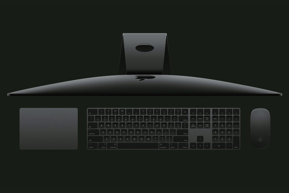
蘋果的“設計魔力”消失了嗎? 整整一代的無與倫比的產品,使蘋果成了世界上最有價值的公司。不過現在也有不少果粉質疑后喬布斯時代的蘋果還剩下幾分設計功底。其實蘋果的設計水平依然是業界頂尖的,你可點此了解更多。 |
Has Apple Lost Its Design Mojo? A generation of peerless products made Apple the world’s most valuable company. Now some in the i-universe are questioning if the magic—in the post–Steve Jobs era—is still there. Don’t believe the naysayers. Read more. |
戴森/Dyson

|
什么樣的吹風機最酷?一要有強大的研發,二要有高度的專注 英國工業設計師詹姆斯·戴森的神奇之處,就在于他將顛覆性的創新技術與“蘋果流”的極簡主義融為一體,將吸塵器、電風扇、吹風機這種無趣的家用產品變成了令無數人心儀的東西——比如上圖中的戴森超聲波吹風機。它的研發耗時足足4年,光原型機就設計了600多個。它內置的數字馬達的重量只有傳統吹風機的一半,速度卻是傳統吹風機的八倍。 如此的嚴謹對戴森來說并非孤例。戴森是英國機器人和人工智能領域的最大投資者。隨著公司的工程師和科學家越來越多(到2020年或將翻一番,達到6000人),2017年9月,戴森公司還成立了一所內部大學——戴森工程技術學院。戴森公司還計劃在2020年前投資26億美元用于研發電池動力汽車。 |
When is a hair dryer cool? When it’s the product of powerful R&D and laser-like focus British industrial designer James Dyson has spent his career marrying disruptive technology with an Apple-esque minimalism to transform drab everyday appliances such as vacuum cleaners, fans, and hair dryers into products with cult followings. Case in point: the Dyson Supersonic hair dryer pictured above. Developed over four years and through 600 prototypes, it features a digital motor half the weight and eight times the speed of a traditional dryer. Such rigor is no anomaly. Dyson is the U.K.’s biggest investor in robotics and artificial intelligence research. In September, the company launched the Dyson Institute of Engineering and Technology, a university within its office grounds, to feed its growing headcount of engineers and scientists, which Dyson predicts will double to 6,000 by 2020. Dyson also plans to invest $2.6 billion into developing battery-operated vehicles in the same time frame. —D.Y. |
谷歌/Google

?
|
用心去做電子消費產品和軟件 成熟的谷歌終于有了自己的審美了。像蘋果、雅虎、亞馬遜等很多科技公司一樣,早期的谷歌在審美上也有過一段不堪回首的經歷。早期的谷歌喜歡的是恣意使用各種顏色、字體和標點符號的“殺馬特”式審美(不信的可以看看1998年的谷歌主頁)。隨著時間的推移,谷歌的大多數競爭對手們也都成熟了,漸漸放棄了那些不上檔次的審美怪癖,風格越來越靠近極簡主義,在顏色搭配上也越來越控制和考究,其中最具代表性的就是那種光滑亮澤、頗具未來主義和德式工藝風的“蘋果范兒”。不過在19歲生日來臨之際,谷歌卻重拾起了它的少年心,將先進的工業設計、軟件設計與奇怪的造型、新材料和明亮的顏色(比如Pixel 2手機的電源鍵)相結合,在這樣一個手機外觀設計千人一面的時代,迸發出了豐富的人的活力——這也提醒了上面那幾家科技巨頭,盡量別把自己搞得太嚴肅了。 三星/Samsung 整體的戰略信念 前幾年,三星還站在法庭上針對蘋果的指控竭力辯駁“你憑什么污人清白”,不過經過幾十年的厚積薄發,三星也終于摘掉了廉價機的帽子。如今的三星是在研發上最舍得下本的科技公司了。它的電視、電話、家電、服務和地產等也都在市面上頗受追捧。 亞馬遜/Amazon 以人為本的資本主義 好設計不僅看審美,更看功能。說到功能性,誰能拼得過“賣一切”的亞馬遜呢?從強大的電商網站,到線下的無現金實體店,再到亞馬遜出品的一系列語音控制設備,亞馬遜對顧客的關注始終是不容忽視的。 華為/Huawei 打造創新基礎 現下,中國的科技巨頭紛紛將眼光瞄準了海外市場,可由于知識產權的原因,很多中國公司也只能是望洋興嘆了。不過華為卻有闖蕩海外的底氣。這家總部位于深圳(可不是“山寨”哦)的設備廠商在軟硬件專利上已經走在了全球前列。 微軟/Microsoft 為99%的人而設計 微軟的界面設計相當杰出,它現代都市感的設計語言和互動化的流暢設計體系都非常值得稱道。但其最杰出的一點,就是它對包容性設計的專注,哪怕是殘疾人也可以一樣使用它的產品。 |
In search of consumer electronics and software with soul Google is all grown up. As with many tech companies—Apple, Yahoo, even Amazon—Google’s design language has come a long way since its kaleidoscopic early days, when every color, typeface, and punctuation mark was used with abandon. (Seriously—just look at that 1998 homepage.) Over time, most of Google’s peers matured by shedding their quirks and shades in favor of minimalist forms and a restrained palette, best embodied by the sleek, futuristic, Braun-influenced stylings of Apple. Not Google. In the wake of its 19th birthday, the company, now part of the conglomerate known as Alphabet, has retained the personality of its youth by wedding sophisticated industrial and software design (have you seen Google Home and Android 8.1?) with strange shapes, novel fabrics, and pops of bright color, such as the power button on its new Pixel 2 phone. In a world where today’s angular machines are plastic and glass, black and white, and altogether expressionless, Google’s products burst with the exuberance of, well, humans—a signal to its peers that they shouldn’t take themselves too seriously. —A.N. Samsung Holistic, strategic conviction It wasn’t so long ago that Samsung found itself in a courtroom defending its creativity against Apple. But the company’s decades-long bid to move beyond its reputation as a budget brand has paid off. Today Samsung is tech’s largest spender on R&D. And its TVs, phones, appliances, services, and offices? Covetable. —A.N. Amazon Human-centered capitalism Good Design isn’t limited to aesthetics; it is equally about function. And what could be more functional than the store that sells everything? From its bulletproof website to its cashierless stores to its family of speech-enabled devices, Amazon’s customer focus cannot be ignored. —A.N. Huawei Building a base of innovation When China’s tech giants looked to markets beyond their own shores, it was clear that many wouldn’t be able to make the trip thanks to dubious intellectual-property portfolios. Not Huawei. The Shenzhen (but not shanzhai) gadget maker is a leader in international patents for software and hardware alike. —A.N. Microsoft Design for the 99% There’s much to be said about Microsoft’s whiz-bang interfaces, modern Metro design language, and interactive Fluent Design System. But what sets this titan apart is its emphasis on inclusive design that makes products as accessible to people with disabilities as to those without. —A.N. |
IBM
|
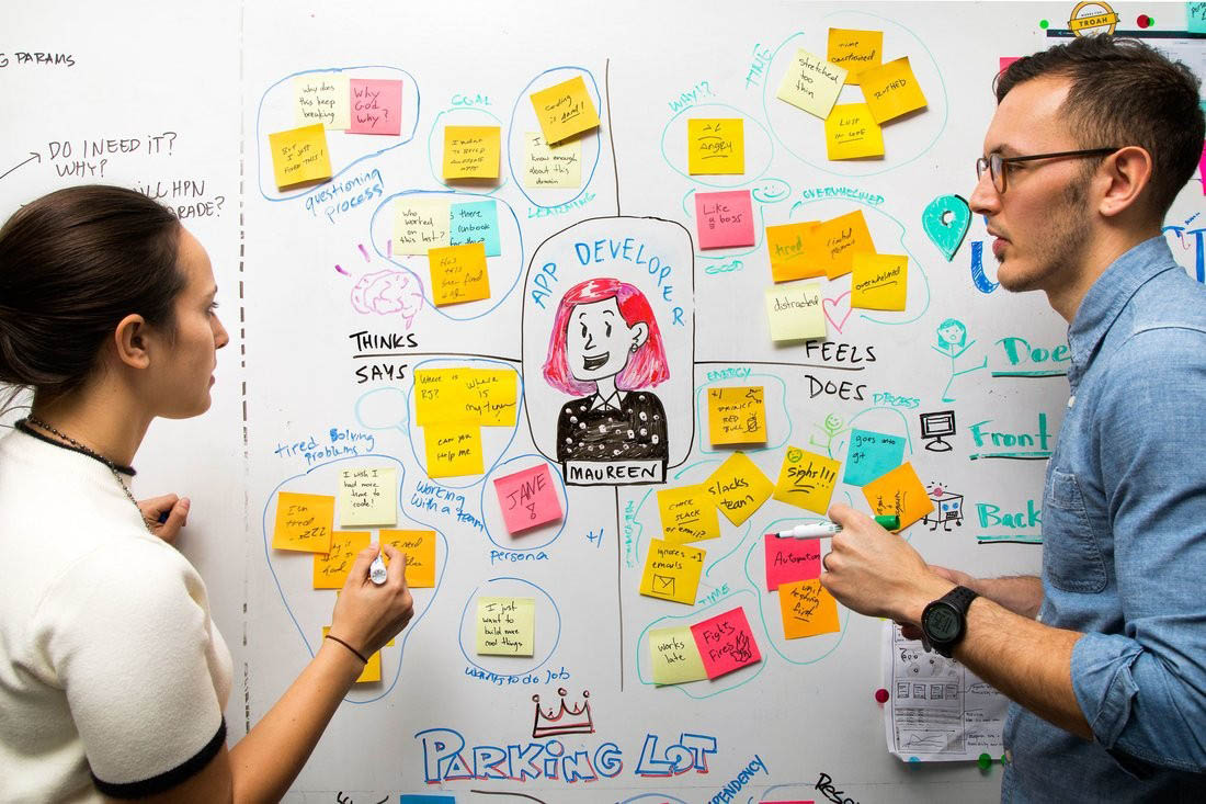
為顧客貼上便利貼 為了在認知計算和網絡安全時代贏得勝利,IBM也在設計思維上投下重注。所謂的“重注”有多重?據說IBM的設計團隊是全球企業中最大的。 |
Putting a sticky note on the customer To win in the age of cognitive computing and cybersecurity, the venerable tech giant is betting big on design thinking. How big? It now boasts the world’s largest design team. Read more. |
|
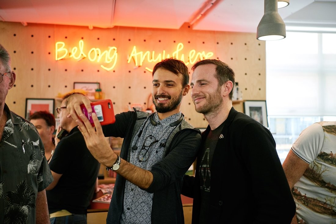
很少有哪家公司像愛彼迎一樣重視設計思維。其三名創始人中有兩名(首席產品官喬伊·杰比亞和CEO布萊恩·切斯基)畢業于羅德島設計學院。這一點最初讓一些“唯學歷論”的投資人對他們敬而遠之,但事實證明,他們的設計學背景其實是個很大的優勢。現在的愛彼迎已經成了共享經濟領域響當當的一家公司,估值高達310億美元。杰比亞還兼任愛彼迎的設計與創新工作室Samara的負責人。 |
Few companies have emphasized the importance of design thinking as much as Airbnb. Two of the San Francisco startup’s three cofounders, chief product officer Joe Gebbia and CEO Brian Chesky, are graduates of the Rhode Island School of Design (RISD)—a biographical detail that turned off some investors at first but turned out to be a big advantage for the sharing-economy giant, now valued at $31 billion by investors. We spoke with Gebbia, who also serves as head of Samara, the company’s in-house design and innovation studio, about his ?approach to design. Read our Q&A with Joe Gebbia here. |
Musical.ly
|
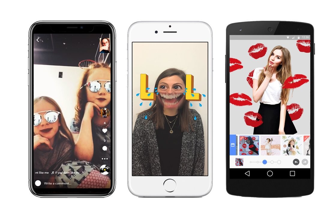
一款大熱社交視頻應用的秘訣是什么?答案是:一個注定會火的設計 MTV什么的早就是上世紀的玩意了。現在的年輕人會自己錄制唱歌的MV和視頻小表情發布到一個叫做Musical.ly的熱門應用上。可能很少有人知道,這個“對口型”應用其實是一款純粹的國產應用,起初它是出于教育用途發布在某平臺上,沒想到孩子們對微積分沒興趣,反而在這款應用上瘋狂模仿起了泰勒·斯威夫特。這家公司之所以增長得如此之快,也離不開幾個小而重要的設計創新——比如APP的水印是可以移動的,這樣就不必擔心它被分享到其他應用上。目前該應用已經擁有6000萬名月活躍用戶,而且被中國互聯網公司今日頭條以10億美元收購了。 |
The secret to this wildly popular social video app? A design that’s engineered to go viral MTV is sooooo last millennium. Today’s tweens produce their own music videos by accessing libraries of 15-second song clips—not to mention a plethora of ridiculous face “lenses”—on the hit app Musical.ly. The founders of the China-based, DIY lip-synching service, originally launched as a platform for educational tutorials, caught on to the fact that kids prefer copying Taylor Swift to watching calculus how-tos early on. Another lesson? Small but significant design tweaks—like moving the Musical.ly logo so that it wouldn’t be cropped out when shared on other apps—helped the company grow its user base much faster. All of this has helped the booming music video maker generate 60 million monthly active users and get snapped up by the Chinese Internet firm Toutiao for as much as $1 billion. —M.L. |
|
Snap 用戶體驗新旅程 老實說,你剛下載Snapchat時,或許根本就不知道它怎么用。我應該滑動屏幕嗎?菜單欄在哪呢?Snap打破傳統的用戶體驗也延伸到了它熱門的濾鏡和不那么受歡迎的眼鏡配件上,讓一個高度依賴內容的領域煥發了新的生機。 美圖 勝過最牛逼的化妝 曾幾何時,PS的圖片總是看起來不太自然。然而來自中國的一款神奇應用——美圖,卻讓千百萬年輕人擁有了美化自拍照片的能力。自從有了美圖,什么亮眼、柔膚、瘦臉、豐胸都不在話下。美圖公司出品的系列應用(美顏相機、潮自拍、美妝相機)已經在全球范圍內被下載安裝到了10億多部手機上,它讓高深的AR和機器學習技術以這樣一種方式普及到了千家萬戶。美圖成功的秘訣,就在于將自拍的藝術做到了極致,同時迎合了年輕人的自戀需求。 保護體驗 我們剛剛才表揚了打破用戶體驗規則的Snap。而對于Snap的競爭對手Instagram,我們建議其在添加了視頻和故事功能后(這也是抄襲Snap的),繼續在它的核心體驗中保持舒適的社交環境。當然,這與它的母公司Facebook給出的一系列選項顯然南轅北轍。 |
Snap New adventures in UX Let’s be honest: You probably didn’t know how to use Snapchat when you first downloaded it. Do I swipe? Where’s the menu? Snap’s convention-busting approach to user experience, which extends to its popular filters and unpopular Spectacles, reinvigorated a category known for its heavy reliance on feeds. —A.N. Meitu The most intuitive makeovers imagined Touched-up photos never looked so good. Yet another China-based app maker, Meitu (the name means “beautiful picture” in Chinese), is enabling millions of young people to enhance their selfies—brighten eyes, smooth out skin, tweak and enhance features, or whatever their mobile-first heart desires. The company’s series of apps (think BeautyCam, SelfieCity, and MakeupPlus) have been downloaded and installed on more than 1 billion phones worldwide, making complex technologies like augmented reality and machine learning accessible to regular people. Meitu’s secret sauce? Tapping into the current demand for mobile apps that do one thing and do it well—plus catering to narcissistic tendencies. —M.L. Protecting the experience Sure, we just celebrated Snap for breaking the UX rules. But we commend rival Instagram for preserving its soothing social environment even as it adds live video and Stories (copied from Snap, naturally) to its core experience. It’s a far cry from the busy buffet of options offered by parent Facebook’s namesake app. —A.N. |
特斯拉/Tesla

|
重新定義汽車行業 特斯拉的意義不僅在于做火了電動汽車,而是為所有車主設計了新的出行典范。 福特 |
Redefining an industry It’s not just about making electric cars sexy. Elon Musk’s ultra-ambitious company is designing a new paradigm for all drivers. Read more. Ford |
|
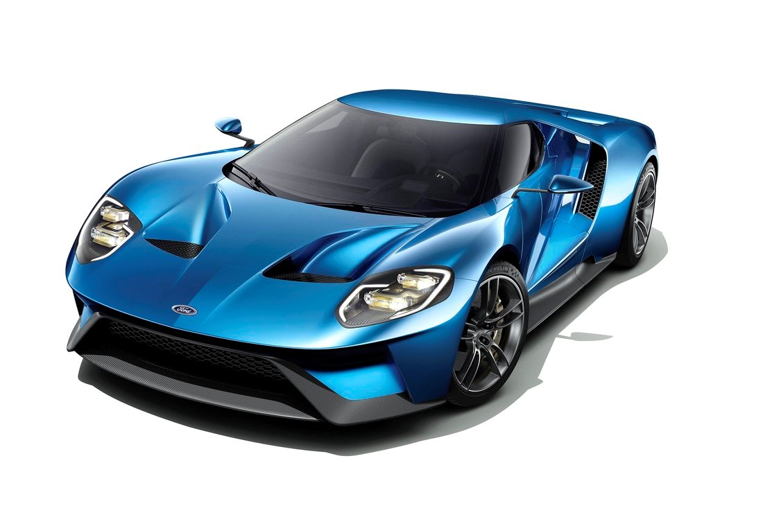
提高對設計的重視 自從五月執掌福特以來,以設計思維見長的吉姆·哈克特就在加速推動福特的設計轉型。(哈克特也是所謂的“開放辦公計劃”之父,他在加盟福特前曾任Steelcase公司CEO。)其中,快速的原型產品設計與構思以及對于“移動化”的關注都是變革的一部分 奧迪 |
Revving up the focus on design Since taking charge of the Detroit auto giant in May, design-thinking acolyte (and, prior to joining Ford, the father of the open-office plan, as CEO of Steelcase) Jim Hackett has been shifting gears at the maker of the iconic F-150 pickup truck. Rapid prototyping and ideation are part of that process, as well as a focus on “mobility” as much as cars. —E.F. Audi |

|
為駕駛員提供新視野 作為大眾旗下高端品牌的奧迪公司在2017年開設了一家全新的設計中心。然而事實上,為了建立高質量、高科技的設計形象,奧迪已經在設計上浸淫了多年。尤其是在車內設計上,無論是美觀先進的多媒體顯示屏,還是精心設計的燈光和聲音系統,都能給乘客帶來美的享受。 現代 快速邁向新技術 賣車的關鍵是速度。現代公司于2017年下半年在首爾南部開設了一間龐大而先進的設計工作室,或許也與這一理念不無關系。現代公司希望將設計一輛轎車的時間(3年)縮短一半,好趕上無人駕駛汽車創業品牌Waymo等競爭對手的速度。 ? |
Offering drivers a new vision The high-end German automaker, a division of Volkswagen, opened a spiffy new design center in 2017. But it’s been building a reputation for high-quality, tech-forward designs for quite some time. That’s especially true in the auto cabin, where passengers are treated to sleek, state-of the-art displays and obsessively engineered lighting and sound systems. —E.F. Hyundai Moving fast into new technology when it comes to selling cars, it’s all about speed—or such is the rationale that led Hyundai to open an enormous, cutting-edge design studio south of Seoul in late 2017. The Korean automaker hopes to cut in half the time (three years) it takes to design a car—an effort, in part, to keep pace with new rivals such as autonomous vehicle startup Waymo. —E.F.?? |
|
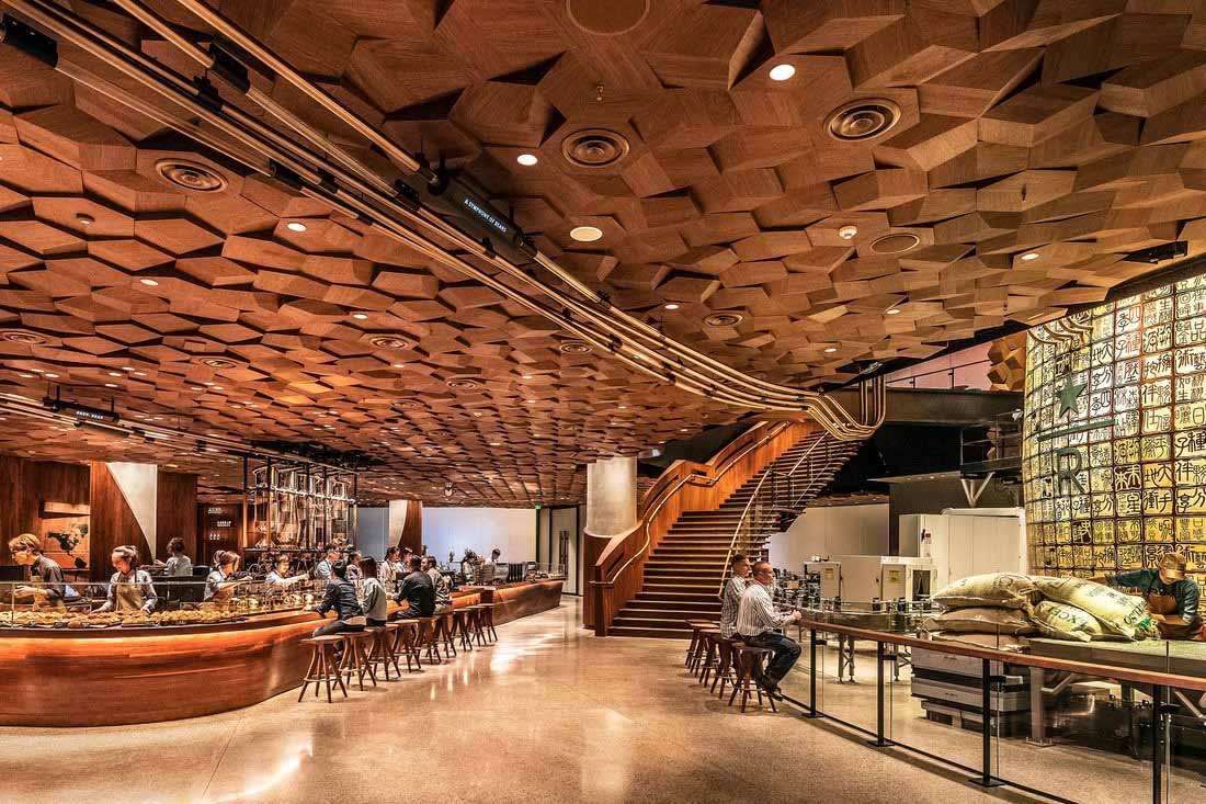
星巴克如何在全球打造個性化體驗? 作為全球最大的連鎖咖啡店,星巴克賣的不僅是咖啡——它還想賣一種體驗。星巴克的創意和全球設計高級副總裁利茲·穆勒表示,星巴克在全球有27,000多家門店,公司將每家門店都設計得如同當地的本土咖啡店一樣。有時根據國家和社會的情況,還會邀請一些知名設計師(如日本的隈研吾)來設計一些細節。 近日,星巴克在上海新開張了一家占地30,000平方英尺的原生態焙烤咖啡體驗館。它既是星巴克全球第二家超豪華烘焙工廠店,也是星巴克至今為止在全球范圍內的最大門店。在店內的顯眼處放著一把由中國匠人手中雕琢的紫銅壺,類似的中國元素在店內的烘焙吧和茶瓦納吧也可以看到——這兩個區域也是星巴克第一次單獨開設。另外該店還提供了“VR之旅”,其技術由中國電商巨頭阿里巴巴提供。 ? |
How the Seattle coffee giant is creating custom experiences worldwide The world’s biggest coffee chain doesn’t just sell java—it wants to serve up an experience. Starbucks has crafted each of its 27,000 outlets worldwide to feel like locally owned and designed cafés, says Starbucks’ senior vice president of creative and global design, Liz Muller. Artists, and the occasional “starchitect”—such as Japan’s Kengo Kuma—are tapped to customize details by country and community. Muller’s latest feat: a sprawling 30,000-square-foot Starbucks Reserve Roastery in Shanghai that opened in December. It’s the second of Starbucks’ ultra-luxurious innovation lab spinoffs and its largest store to date. A copper kettle roaster hand-carved by Chinese craftsmen takes pride of place in the outlet, which also features an on-site bakery and Teavana bar—both firsts for Starbucks—and virtual reality tours powered by Chinese e-commerce giant Alibaba. —D.Y. |

|
賣得更多,但用得更少 很多人走進宜家購物時可能并不知道,宜家無形中將它的幾百萬顧客都變成了環保主義者。宜家宣稱其使命是要減少它銷售的所有商品的碳排放,而只要購買了宜家的商品,消費者就會無形中成為這個宏偉目標的一部分。 宜家認為,環保問題是可以通過設計解決的。比如木頭出現在宜家三分之二的家具產品中。2016財年,宜家的木材使用量較上年減少了2%,然而它賣出的木制品實際上更多了。一種方法是在它經典的Billy書架產品中使用了雙密度膠合板,從而使材料耗費減少了20%。宜家的設計也有助于消費者在家中節省資源。比如它的所有廚房水龍頭都內置有通氣裝置,這種設計能達到相同的壓力流和用水感,但實際上卻能節約40%的用水。 宜家的綠色設計理念也取得了成功。2016年,宜家的環保設計產品的銷售額約為20億美元,現在宜家已經將目標調整為在2020年達到30億美元了。 ? |
Selling more, but using less There’s an irony in how Ikea—a company whose business is selling stuff, and lots of it—is turning the millions of customers who visit its stores every day into accidental environmentalists. By buying Ikea’s products, consumers also are inadvertently buying into the Swedish furniture giant’s mission to reduce the footprint of everything it sells. Ikea views its environmental impact as a problem that can be solved with design. Take wood, which shows up in about two-thirds of the company’s home furnishings. In its fiscal 2016, Ikea used 2% less of the material than it did the previous year, despite selling more wood products. One way was by using dual-density particleboard in its iconic Billy bookcases, which cut down on materials by 20%. Ikea’s design work is also helping customers use fewer resources at home. All of its kitchen faucets now have an aerator. The feature mixes in air with the pressure flow to achieve the same feeling of wetness while using 40% less water. The green design mindset has paid off too. Sales of sustainable products were around $2 billion in fiscal 2016, and Ikea is targeting about $3 billion by the middleof 2020. —B.K. |
百事/PepsiCo
|
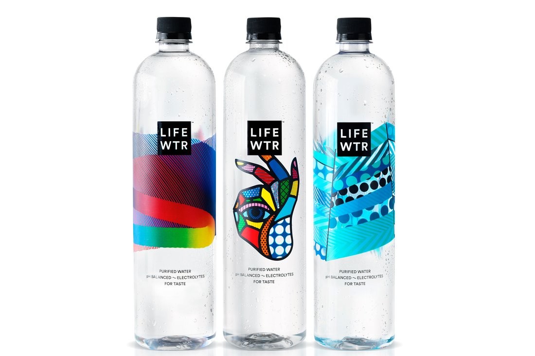
向產品灌輸活力 好的設計遠遠不只是給汽水瓶子設計哪種藍色圖案這么簡單,這也是為什么百事CEI盧英德2013年從3M公司請來了莫洛·普契尼做首席設計官,并將設計思維作為公司的優先戰略要務,并于次年在紐約迅速成立了設計與創新中心。對設計的關注也催生了一系列新產品。比如2016年,百事公司推出了一種高價瓶裝水Lifewtr,它的包裝就是由藝術家設計的,而且每年都會改變幾次。 第一資本 跳出銀行業思考 銀行業和先進設計似乎并不沾邊,但第一資本公司卻跳出傳統銀行的角度,用設計思維將自己改造成一家軟件公司和創新孵化器。在收購了設計公司Adaptive Path和Monsoon后,第一資本最近推出了一些全新的數字化功能,比如能發emoji小表情的短信聊天機器人、能追蹤GPS位置信息的交易歷史功能等等。2018年年初,第一資本還將在美國里士滿成立自己的1717創新中心。該中心占地42,000平方英尺,擁有一個體驗設計研究室。該中心通過與孵化器項目合作,或將資助50家左右的創業公司。 |
Infusing products with fizz Good design is about more than picking out the right shade of blue for a soda can. That’s why PepsiCo CEO Indra Nooyi recruited chief design officer Mauro Porcini from 3M in 2013 and made design thinking a strategic priority for the food and beverage giant. The creation of a Design and Innovation Center in New York swiftly followed in 2014. And PepsiCo’s new emphasis on design has led to a pipeline of creative products. Earlier this year, for instance, PepsiCo launched Lifewtr, a premium-priced bottled water featuring labels that are designed by artists and change several times per year. —D.Y. Capital One Thinking outside the branch Banking and cutting-edge design don’t automatically go together. But Capital One has adopted design thinking as a mantra to reinvent itself as a software company and innovation incubator, rather than a traditional bank. After acquiring design firms Adaptive Path and Monsoon, Capital One has recently rolled out fresh digital features, from an emoji-enabled SMS chatbot to GPS-tracked transaction histories. In early 2018 it will unveil its 1717 Innovation Center in Richmond, a 42,000-square-foot facility housing an experience design research lab and, through a partnership with an incubator program, some 50 startups. —D.Y. |
優衣庫/Uniqlo
|
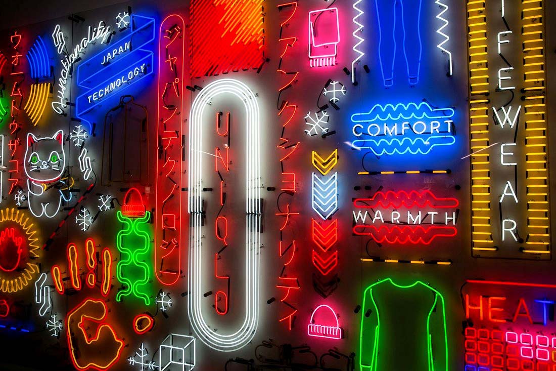
從法瑞爾到任天堂,日本快速時尚品牌優衣庫的合作伙伴遍布各界,為其賦予了獨特優勢 不了解日本零售品牌優衣庫為何迅速火爆全球的人,只需看看優衣庫的總部就明白了。優衣庫的東京總部“優衣庫城”啟用剛滿9個月,占地約188,000平方英尺。它的設計是煞費了苦心的,內部還有一間雜志圖書館和一間菜品十分豐盛的餐廳。優衣庫總部的標準即便拿到硅谷也是相當看得過去的。在這方面,它也是日本企業中第一個敢于挑戰傳統的公司。 優衣庫創始人柳正井也坦承,當他在2001年接手父親的成衣店,并將其重新命名為“獨特服裝倉庫”(Unique Clothing Warehouse)時,他就意識到,自己必須采取一種全球化的心態。他戰略性地在紐約、倫敦、上海等核心城市開設了一些全球旗艦店,并且與任天堂、漫威、法瑞爾·威廉姆斯等知名品牌和流行文化偶像進行了設計合作。就這樣,來自廣島的一家名不見經傳的休閑服務連鎖店,如今已經成了亞洲營收入最高的服裝制造商,在全球擁有1900多家門店。 優衣庫在全球范圍內開設了一些設計和研發中心,同時也在積極探索用人工智能進行設計的可能性,以更好地促進“快時尚”與實用性的結合。優衣庫的產品設計與全球研發高級副總裁勝田幸宏曾說過“人們想讓生活變得容易,而衣服也應該讓人們的生活中的某些事變得容易,比如易于保養,易于行動等。” |
Collaborations with everyone from Pharrell to Nintendo give the Japanese fast-fashion retailer a distinct edge To gain insight into how Japanese retail brand Uniqlo so quickly attained ubiquity around the world, consider parent company Fast Retailing’s nine-month-old headquarters in Tokyo. Named Uniqlo City for its vast 188,000-square-foot sprawl, the ?painstakingly designed space—with its magazine library and fully stocked cafeteria—could easily pass for the office of a cutting-edge Silicon Valley firm, and is the first of its kind to challenge convention in corporate Japan. Likewise, company founder Tadashi Yanai acknowledged early on that he had to adopt a global mindset when he took over his father’s suit store in 2001 and renamed it the Unique Clothing Warehouse. By strategically planting global flagship stores in key cities, including New York, London, and Shanghai, and through design collaborations with prominent pop culture icons and brands such as Nintendo, Marvel, and Pharrell Williams, Yanai built his casual-wear chain from Hiroshima into what is now Asia’s largest clothing maker by revenue, with over 1,900 stores worldwide. Uniqlo has also opened design and R&D centers worldwide, and is exploring the use of A.I. in design in its quest to perfect the marriage of “fast fashion” design and utility. As Yuki Katsuta, Uniqlo’s SVP of product design and global research, once said of the company’s ethos: “People like to make their life easy, and their clothes should make their life easy for something. Easy for maintenance. Easy for action.” —D.Y. |
Nike
|
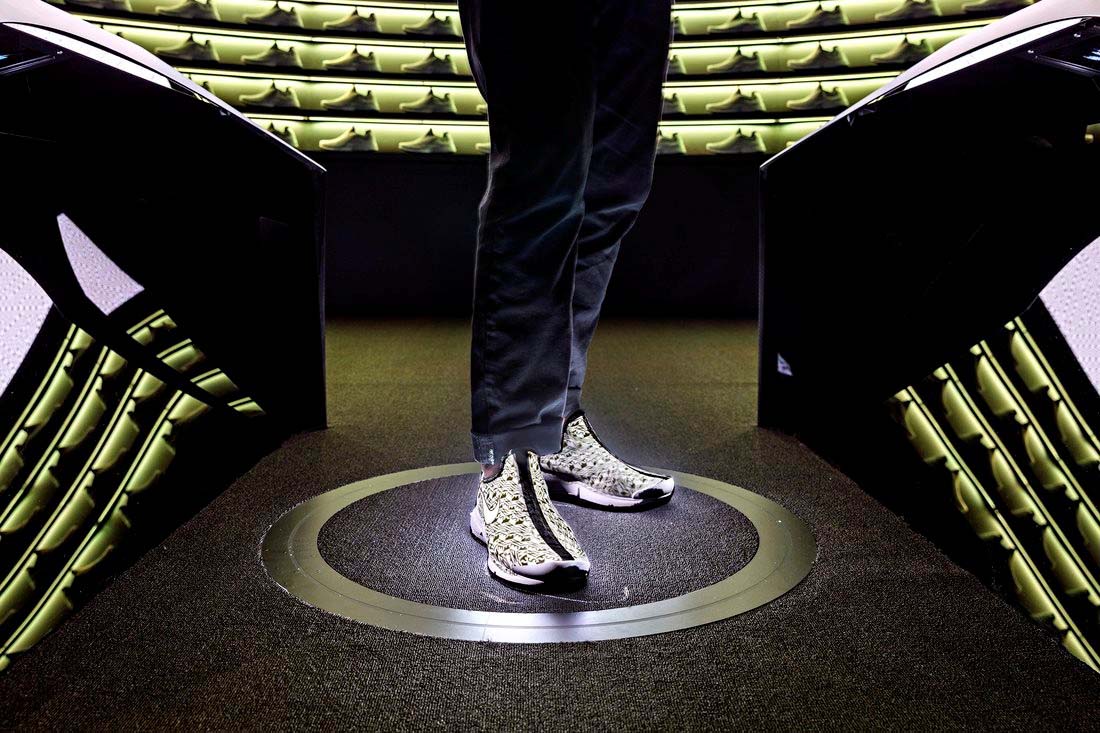
在CEO馬克·帕克的領導下,Nike正在加快定制化的速度 互聯網一代人對需求強調“即時滿足”,因此零售商們也在競相縮短他們的生產周期。2017年九月,Nike公司創新推出了90分鐘獲得定制跑鞋的“Nike制造者體驗計劃”,它也被很多人贊譽為“零售的未來”。位于紐約市的Nike By You工作室使用了AR、物體追蹤和投射系統來設計定制的鞋子,購物者只需一個多小時就能拿到自己的定制鞋。 Nike首席執行官馬克·帕克本人也曾是一名鞋子設計師。他強調,創新是推動53歲的Nike公司轉型的關鍵。(一個積極跡象是,Nike股價在過去一年中已經上漲了27%。)帕克與公司的設計副總裁約翰·霍克一道管理著1000多名設計師。這個龐大的設計團隊幾乎負責公司的方方面面,比如從可回收材料“飛織”和“飛羽”的研發生產,到專門面向穆斯林運動員的“Pro Hijab”頭巾的設計等。 |
Led by CEO Mark Parker, the athletic-shoe titan is picking up the pace on customization Spurred on by the Internet generation’s demands for instant gratification, retailers are racing to shorten their production lead times. In September, Nike pulled ahead of the pack when it debuted the 90-minute Nike Makers’ Experience, dubbed by many as the future of retail. The Nike By You Studio in New York utilizes augmented reality, object tracking, and projection systems to custom-design shoes, which shoppers can collect on-site in just over an hour. As a former shoe designer, Nike CEO Mark Parker has emphasized innovation as key to transforming the 53-year-old company. (A positive sign: Nike’s stock is up 27% over the past year.) Together with VP of design John Hoke, Parker manages a team of 1,000 designers overseeing everything from the development and production of Nike’s sustainable, recycled Flyknit and Flyleather materials to incorporating inclusive designs such as Nike’s Pro Hijab for Muslim |
Zalando
|
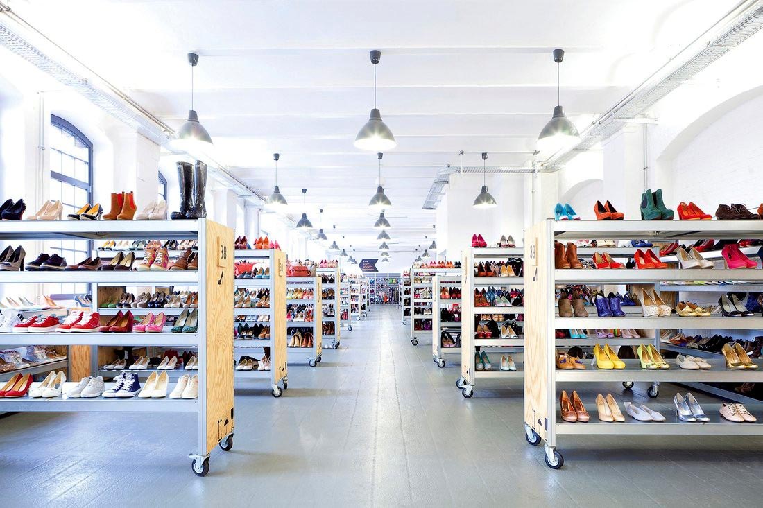
給時尚愛好者真正想要的東西 Zalando是歐洲最大的在線時尚零售商,該公司的產品設計副總裁安妮·帕斯夸爾將公司比作時尚界的Spotify,其任務是幫助消費者找到最適合自己的時尚風格——就像在音樂應用Spotify上找歌一樣。Zalando在15個國家有2000多個品牌在售,另外它也推出了非常好用的移動應用。如果你網購的衣服不舍身,還可以通過Zalando的快遞服務迅速退貨。 飛利浦 做醫學技術領域的設計先鋒 對于設計的重要性,很多公司都是后知后覺,然而現年已經126歲的飛利浦公司早在1925年就意識到了設計的重要。當時,飛利浦聘請了建筑師路易斯·卡爾夫作為公司的首位專業設計師。卡爾夫不僅給公司的廣告提供了標準化的外觀,而且還貢獻了一些經久不衰的設計,比如人人都用過的飛利浦剃須刀。現在的飛利浦設計部門是一個獨立的部門,在9個國家的19間工作室里擁有超過500名設計師。 在首席設計官肖恩·卡尼的帶領下,飛利浦設計部定期與各大醫院和研究實驗室合作,對各類醫療技術進行重新設計。該公司近年的較大突破有Azurion引導治療平臺等,該平臺可以通過實時成像技術,指導臨床醫生進行比較復雜的手術。此外還有按需的3D打印手術工具等。 本文的另一版本載于2018年1月1日刊的《財富》雜志上。? 譯者:賈政景 |
Giving fashionistas exactly what they want Europe’s biggest online fashion retailer fancies itself as the Spotify of fashion, says Anne Pascual, VP of product design for the Berlin company—helping consumers discover styles much as they find new songs. So Zalando, which sells over 2,000 brands in 15 countries, has developed user-friendly apps for browsing looks. If the fit isn’t right, Zalando has a courier service to pick up your returns. —E.F. Philips Staying design-forward in medical tech While many companies are only just warming up to the potential for design to transform business, Philips recognized it as far back as 1925. That’s when the now 126-year-old Dutch appliance manufacturer hired architect Louis Kalff as the company’s first in-house designer. Kalff not only gave the company’s ads a standardized look but also produced enduring designs such as the Philishave razor. Today, Philips Design functions as an independent unit with over 500 designers in 19 studios across nine countries. Led by chief design officer Sean Carney, Philips Design regularly partners with hospitals and research labs to reconceive medical technology. Breakthroughs include the Azurion guided therapy platform, which allows clinicians to perform complex procedures with real-time imaging, and on-demand 3D printing of surgical tools. —D.Y. A version of this article appears in the Jan. 1, 2018 issue of Fortune. |


